
Uniquely YOU! Personalize your lantern or lamp.
Artwork ©Deni Minar
Whether you are wishing to use artwork from one of the amazing artists I collaborate with, or provide your own, this blog post will help you make a sound start - I cover topics related to layout approaches and artwork best practices.
Currently, Feb 2022, there are three collections to choose from, two of them can accommodate unique artwork. As you may have already guessed, they are the
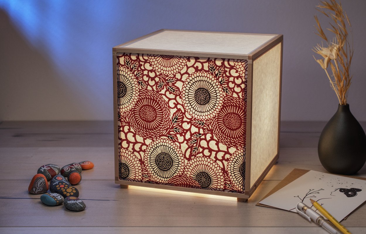
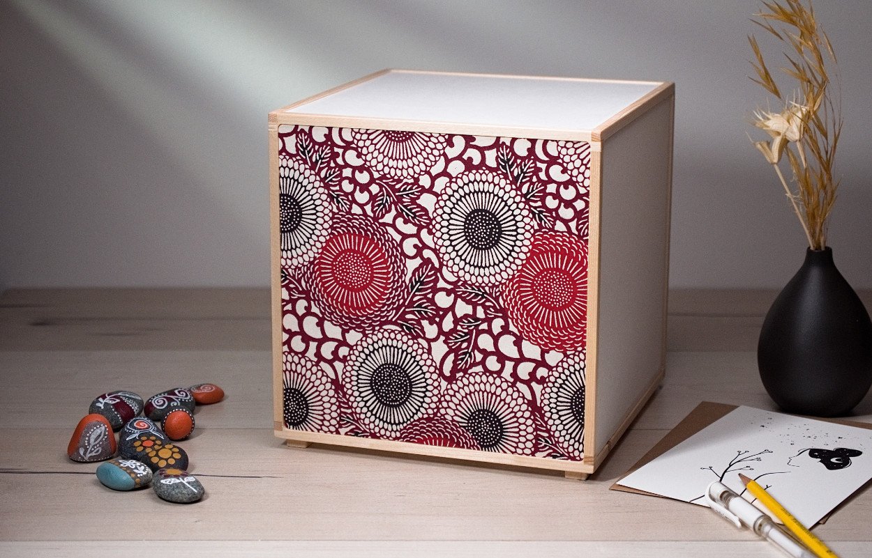
‘Just Be and Bloom’ and ‘Be Gentle’ collections. The latter collection is also ideally suited to Japanese silk screened papers, Katazome-shi and Chiyogami. I will cover this briefly at the end.
I am going to assume you have had a look at these collections and seen how they have been decorated. Have you taken a look at the artwork from each artist I collaborate with? If not, I suggest doing that now before reading further. You’ll find everything in the Artwork/Papers section of my website.
Next, decide what direction you wish to go… choose an existing layout/design and change a part of it - so swap out a piece of artwork with something else you like from the same artist, or go the much more involved path of providing your own artwork.
If you have decided to provide your own artwork, start with these templates… simply click on the collection names that follow next. You will need a printer capable of Legal Size paper (11”x17”) for the ‘Just Be and Bloom’ collection and letter size for the
‘Be Gentle’ collection.
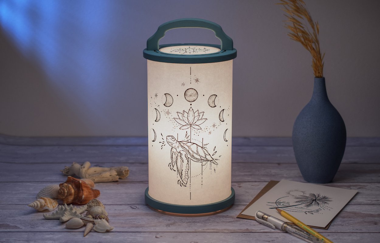
These templates show you how to align your artwork and what you have to work with, size wise. In the case of the ‘Just Be and Bloom’ collection, you only ever see a portion of the larger canvas - this is important if you are going to choose a “focal face” as I have done in all the examples shared.
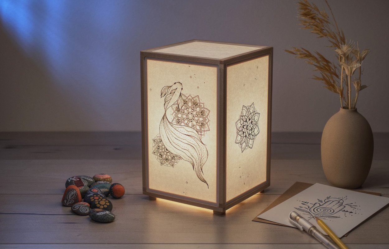
Artwork ©AquaMarynaStudio
While you do not need to approach things this way - so having a “focal face”, I think it helps create something with more wonder and story and lives up to the “simple is beautiful” tag line because it allows for much white space, so important for an elegant result.
When you have your first artwork files ready, I suggest printing them off and mocking-up the actual physical shape. So if a cylinder, use tape to hold the ends together. If the square or rectangle, glue or tape the paper onto some cardboard to form the box shape. This will really help you see things in the real world, 2D artwork to a 3D model, very simply and effectively. This can be seen below.
At this point too, you can take a pencil and mark off, in the case of the ‘Just Be and Bloom’ collection, just how much of each face you end up “seeing” at one time, so you can tweak your artwork.
If your lantern or lamp is going into a particular spot, you can see how this can help you place things just where they are needed. Keep in mind, if you include a handle with your lantern/lamp you should consider how this will reference to the artwork and position. If you really want to take this a step further, find a way to illuminate the mock-up in some way, from within.
With the current artwork found on my lanterns and lamps (all possible through wonderful collaborations), know that if you like the featured artwork, but would like something else on the sides and back, it is all possible. One general guide here though… choose artwork from one artist, do not mix and match, this ensures a harmony in style.

Mockup to see how your artwork works. Artwork by Deni Minar.
I have used several individual artwork pieces, most often, on each lantern or lamp. The ‘primary face’ and then for the sides and back, another two or three pieces of smaller supporting artwork - usually two smaller artwork pieces with a small decorative touch at the seam, or rear face.
With the ‘Be Gentle’ collection, you could treat the rear face as another front face, giving you the option to flip it 180 deg around and immediately have something very different. Keeping more neutral sides that work with both the front and rear, allow the light to escape in order to provide sufficient illumination of the immediate surroundings.
At this point you should have enough information for layout techniques to get going. Please feel free to reach out to me for anything further.

Artwork ©Susana Rodriguez
Next, what is it about the artwork that makes it come to life when illuminated?
Yes, paper choice is really important and there will be a dedicated blog post on this topic for that reason. But, beyond the paper selection, it comes down to ink colour and how this is used to create the artwork.
I have a simple effective approach - ensure your artwork follows the principles/style of a colouring book - that there is a solid black outline to all the elements (which can be fairly thin, but not too thin). This is the single most important thing to keep in mind. This is the part that will provide the definition required for anything that is illuminated. You can see this clearly with the artwork by Deni Minar and AquaMarynaStudio, two artists I collaborate with. Shading/tone is created by using hundreds-thousands of tiny-small dots - this allows solid black ink coverage, creating a defined shape once illuminated. It is such a wonderful illustration technique and works so well here.
Then, secondary to this black outline, if you need to add colour, its to add this within those primary outlines. A wonderful example of this approach can be seen on the right, this is by Susana Rodriguez, one of the artists I collaborate with.
I still discourage the use of colour, even though Susana and I have been able to make her colour art piece work, this after much experimenting, here is why:
I use a low power LED light source - it simply does not have the intensity to blast through a thick material. I only use very thin Japanese Washi papers for this reason as well as one thin 100% cotton paper. A thick material allows the artwork to sit on a surface which is spaced a distance away from the side being hit by light. This helps the artwork remain more visible but requires a much more powerful light source.
Next, colour on thin paper can be very unpredictable when mixed with a warm light. Colours change colour… the orange light shifts things and this can end up looking most unpleasant and not as intended.
Colour ink pigments vary in how they allow the light to pass, some have a strong blocking ability (like black ink) and others little-to-none. This compounds colour related issues in artwork.
Colour may look great with what you print, it is however unlikely I’ll be able to reproduce those results - the Japanese washi papers and cotton papers I use yield different results, one paper responds differently to another, it’s a wild card.
Lastly, being able to print with black ink only, allows me to use a setting that maximizes the black ink use, so its light blocking capabilities are at its best, which is key to a beautiful illuminated result. When I need to print other colours along with black, the black ink may not be fully optimized. The same goes for black with opacity, so greys, a definite no no. I use a 10 colour pigment based large format Canon printer to ensure I get the best results possible, vs a dye based printer. Prints are costly, but there is a cost for longevity and archival results. Back ink only trumps all else and can look so beautiful - the examples here show this, as too the ancient technique of Sumi-e.
Katazome-shi paper, illuminated, night (dimmed to minimum)
So, in summary… black ink only at 100% saturation - it offers the best results and ensures a beautiful printed artwork result.
If after all of this you still wish to experiment with colour, because of some special drawing from your child or anything else you wish to use… I understand. I do have another possible option for you to entertain - I am going to do some research on artists who are able to redraw/recreate/re-interperet photos and drawings that may at first not seem suitable, into a more friendly B+W ink/pen illustration. With the right artist, the outcome could be a perfect fit for those kinds of things more difficult to apply to an illuminated surface. Something I’ll make a note of to try and explore in a future blog post.
I hope at this point you have gained some insight into how to prepare your artwork. Final files provided must be 300dpi, letter size or Ledger (11x17), vector where possible always, PDF, 100% Jpeg or other suitable graphics file.
Lastly, I would like to touch on Japanese silk screened papers, Katazome-shi and Chiyogami. Have you taken a look at the variety available? If not, visit the Artwork/Papers section of the website and click on the thumbnails for these two papers. In there are samples of what I carry along with a link to my suppliers website where you can see the full selection available, it is extensive.
Katazome-shi paper, not illuminated, shown in daylight
Depending upon the pattern chosen, these can work on both the small and large options of the ‘Be Gentle’ collection. You will notice however that I’ve only shown these papers on the large lamp, this is because these particular patterns required the large faces.
When using these Katazome-shi and Chiyogami papers, very little light is able to escape past the paper to further light the environment, this is why I chose to only place the paper on one focal face, the front face. You can certainly put this paper on the sides as well, but I recommend leaving the top and back plain to allow some light to escape and illuminate the immediate space.
Don’t be afraid to mix and match different patterns, the front one pattern and the two sides a different pattern. I suggest keeping colour on the front and more muted, less decorated or B+W artwork, for the sides.
Think about how you are going to place your lamp… perhaps you are going to see two faces the majority of the time, if the lamp is placed 45 deg to a back wall - in this case, treat these two faces as front faces and leave the other faces, including the top, with a paper selection that allows for maximum light to escape and illuminate the environment. In another blog post I will explore the plain papers that can be used in conjunction with these very decorative papers.
We’ve reached the end of this very first blog post! I hope you have found it useful.
(Please note: all supplied artwork will first need to be reviewed. I will also need additional documentation which I’ll outline at the time)